Case Study: Media Blue Kitchen Revival
Our client purchased their home 14 years ago knowing that their kitchen would eventually need to be completely gutted. In their info call questionnaire, they said they were, “completely overwhelmed with where to start.” A very common pain point for most of our clients. The space was outdated, but the real issue was the layout.
Layout
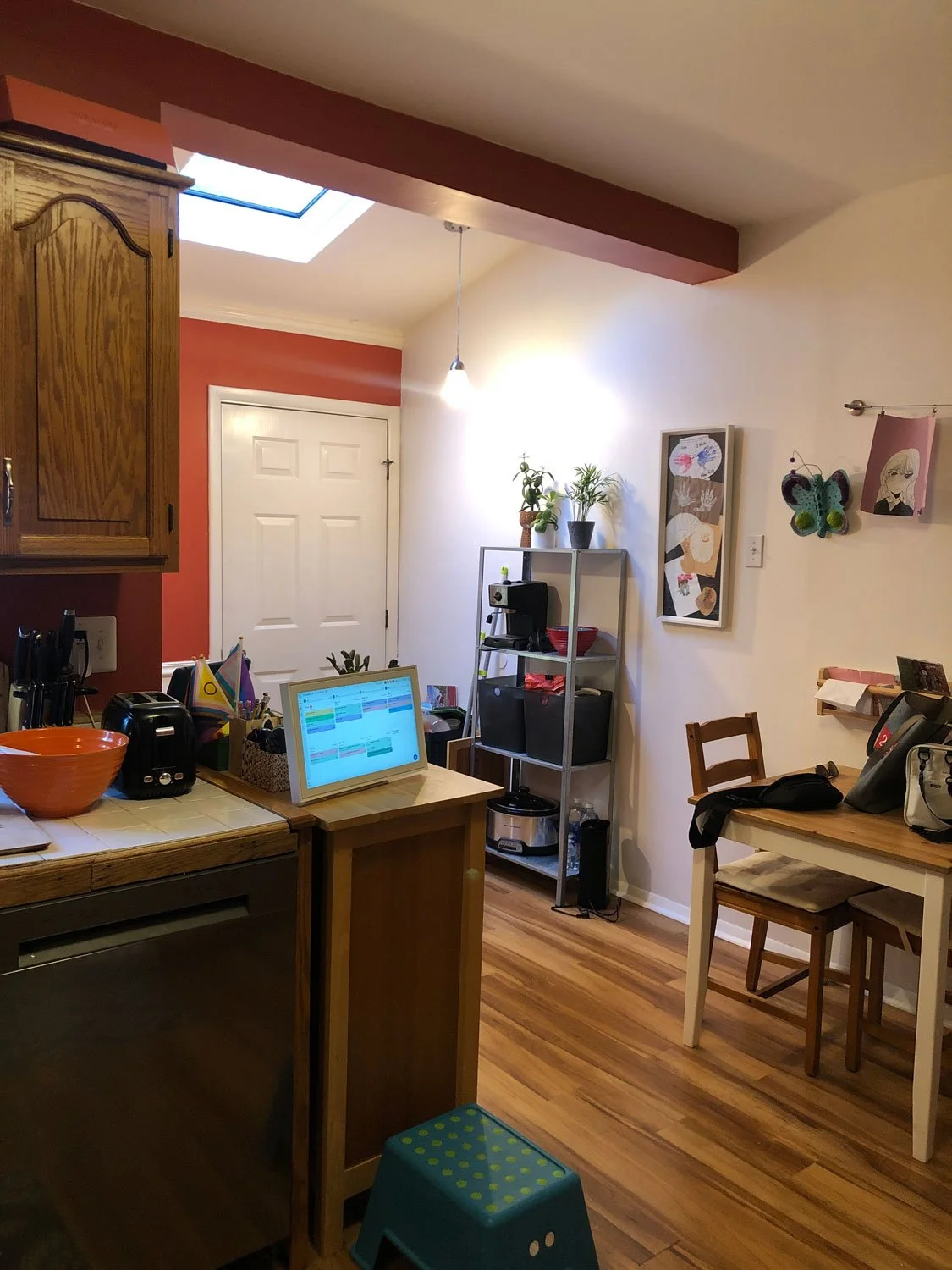
Previously, the kitchen felt very disjointed. Most notably, the refrigerator was tucked into the corner—space that was a consequence of the termination of the basement stair underneath. There was also an awkward working space by the back door. After discussions with several prospective contractors we came to the conclusion that this area used to be a porch (or at least part of a porch) that was closed in by a previous homeowner. That explained the structural beam dividing the space, showing the end of the original home and the beginning of the addition.
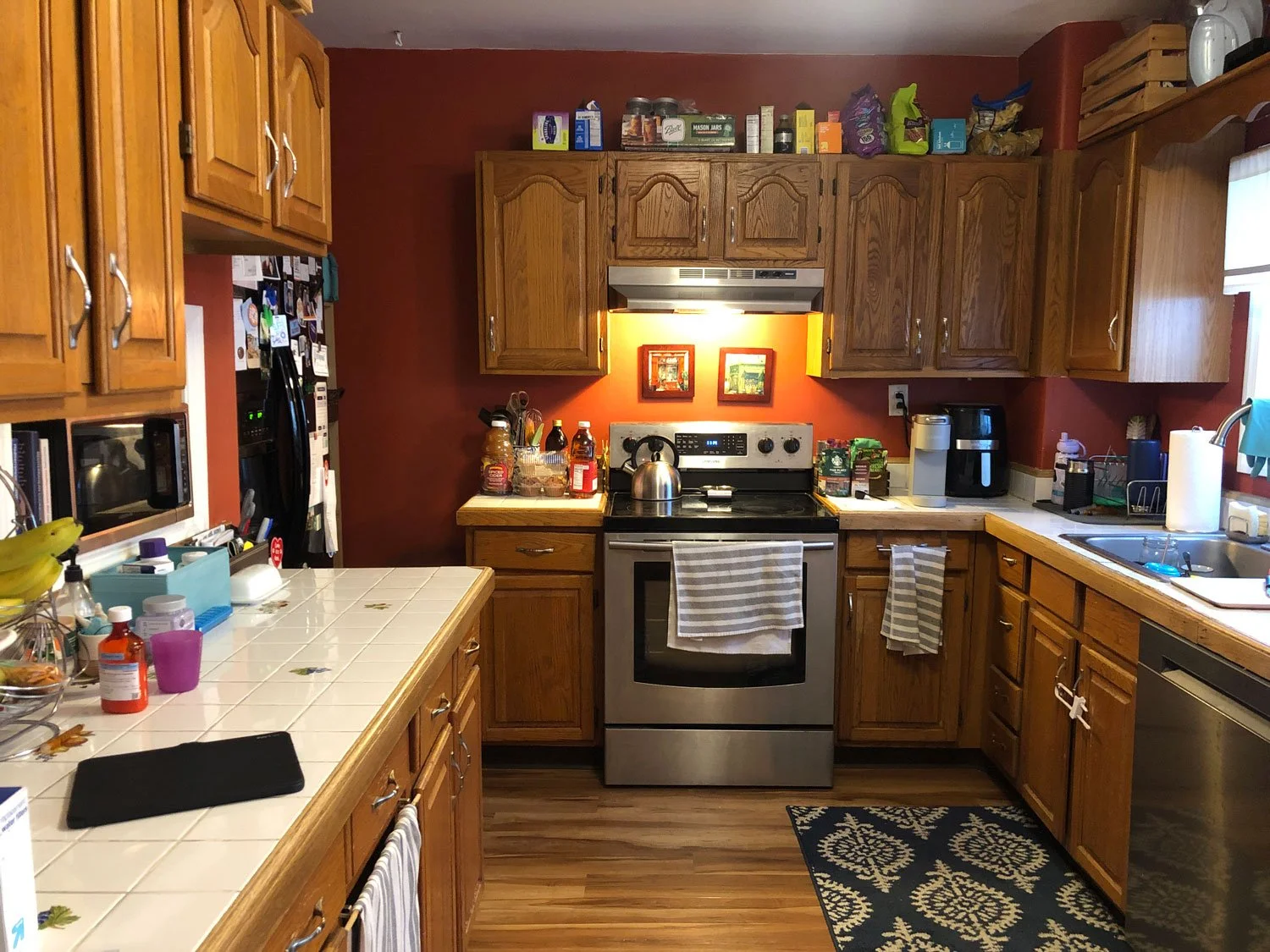
The upper cabinets felt a bit random in some areas. On the wall shared with the basement stair a microwave niche was cut out (that you could see while descending the basement stair). Above that was a short cabinet, that’s usually reserved for above sinks, ranges and refrigerators. On the sink wall, upper cabinets added more storage, but also made the space feel a bit claustrophobic. Storage is often a top priority for clients, but a bit of negative space is always good to create visual balance.
After surveying the space we jumped into the crucial space planning process. Starting with a fresh slate, we disregarded the current floor plan with the exception of the existing windows and doors and completely reworked the kitchen layout.

Old Floor Plan | Newly Designed Floor Plan
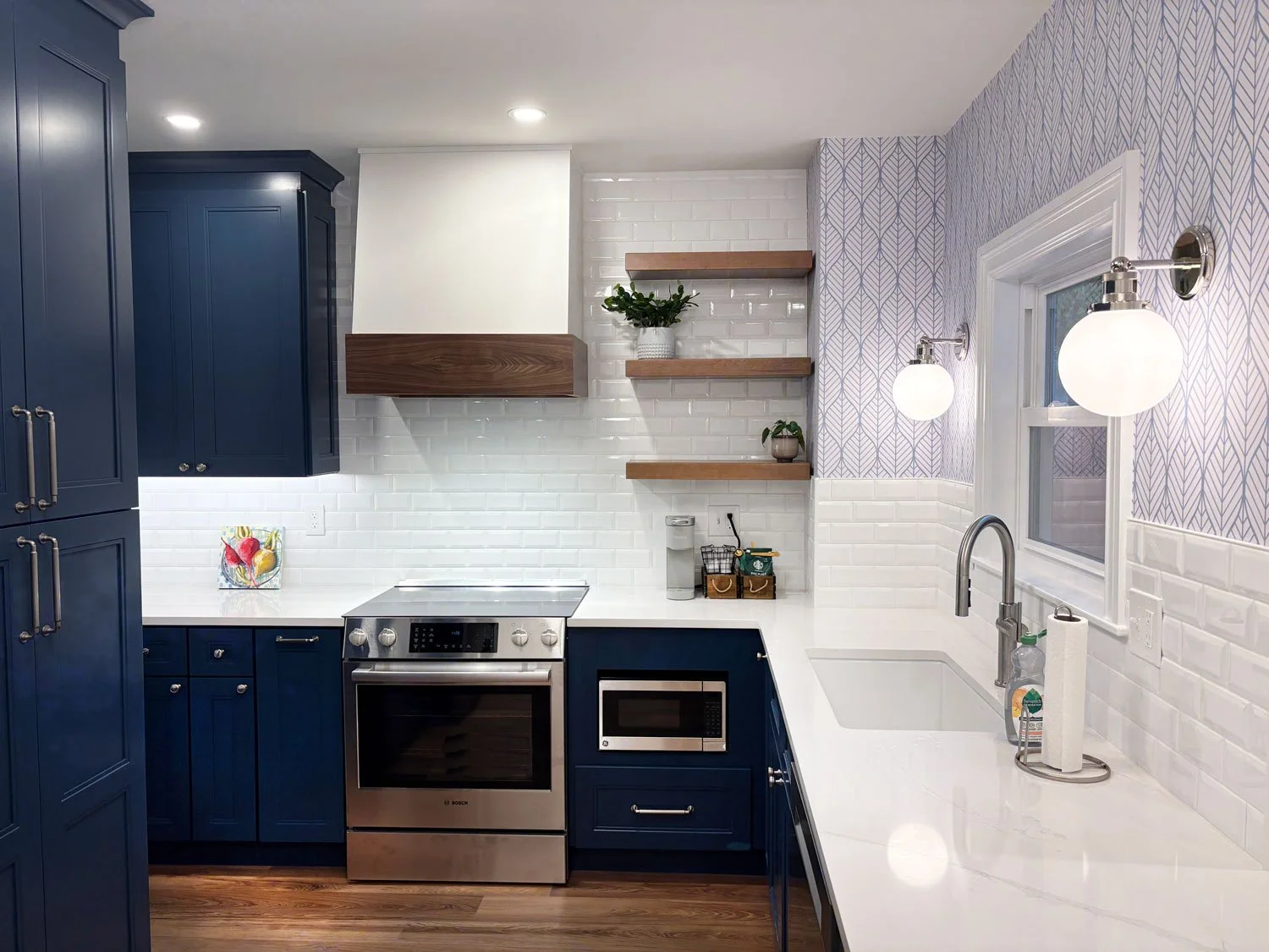
We ended up moving the refrigerator out of the corner and making it easily accessible upon entering the kitchen from the dining room. To the left of the refrigerator is a shallow cabinet which is appropriate for smaller items like vitamin bottles. To the right of the refrigerator is a full height pantry cabinet with roll-outs on the bottom. Our client has two young children and we’ve found that roll-outs are a favorite…especially for snacks.
We kept the sink in front of the window. But moved the range over a bit to allow for more space in between major work zones. This move also allowed for a small coffee bar area between the range and sink. We wrapped the base cabinetry on the sink and range wall and continued into the corner which makes that area feel much less congested and adds a significant amount of counter space. The opposite end of the run of base cabinetry features a peninsula with space for two counter stools. Open shelving was added throughout so that our client would have dedicated spaces for her plants.
At eye level, the kitchen also got a major upgrade. Without upper cabinetry, the sink wall can visually breathe now. This area feels so much more spacious and airy. On the range wall, we have a hood painted in Sherwin Williams Snowbound that visually disappears into the wall with the exception of wood trim along the bottom. The wood detail is in the same tone as the open shelving and beam that was cladded in wood.


Lighting
The existing recessed lighting was upgraded and we added undercabinet lighting. There’s a multi-light flushmount as well. But the focal point is definitely the globe sconces flanking the window above the kitchen sink.
Materials and Finishes
From the beginning, our client knew that they wanted colored cabinetry and were leaning towards blue. We actually looked at several cabinetry lines that each offered different hues of blue to find just the right tone. The back door was painted to match the cabinetry, pulling the color through the entire space.
We also noted a classic white subway tile in our Boutique Consultation Recap. There are several ways to change up subway tile in order to make every kitchen a bit unique. In this space, we opted for a beveled tile that adds some dimension to the walls. Above the subway tile is a white and light blue wallpaper with a modern leaf pattern.

The structural beam used to be wrapped in painted drywall. When there’s a beam running through the middle of a space you can either try to hide it or celebrate it. Hiding it wasn’t working, so we decided to make this a design feature. The contractor, TDJ Renovations, wrapped this beam in a walnut veneer which makes the beam placement look much more intentional.
All the metals are in nickel and the countertop is white with thinner gray veining to contrast the deep blue cabinetry. A painted wainscot breaks up the long wall that extends from the entry to the back door.
Final Thoughts
This kitchen offered several spatial challenges, but we made it work through some creative space planning which is kind of our thing. The updated materials and thoughtful placement of solid and void make this space feel so much bigger. More importantly, this kitchen is much more functional!
Related Blog Posts