3 Interiors Where We Went Dark
A deep, saturated wall color can completely change the feel of a room. Most people are afraid to stray away from a light neutral hue for their walls or cabinetry, but more often we’re working with clients that appreciate dark paints as much as we do!

Moody In Moorestown
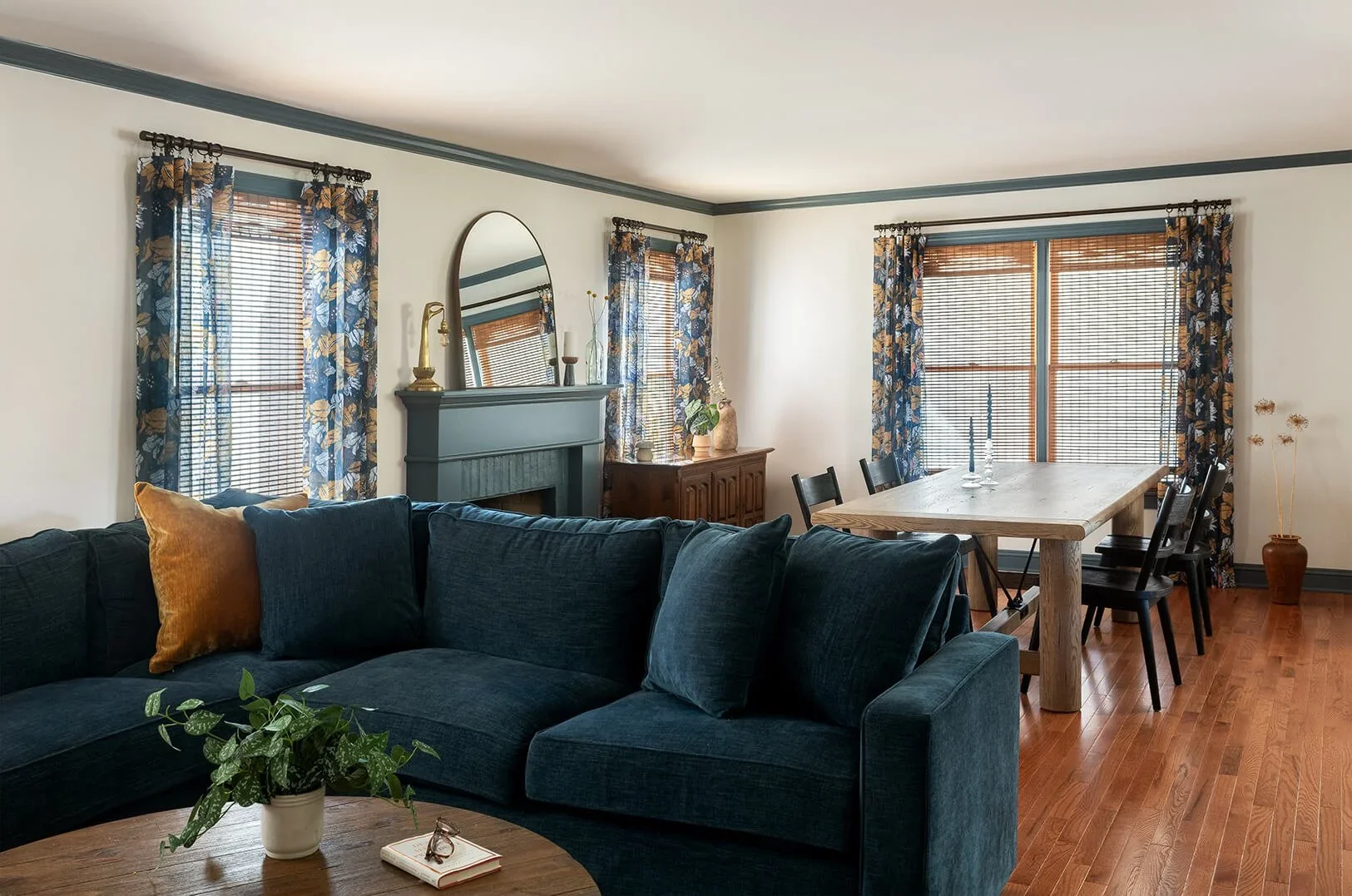
Our client hired us to make her living spaces in her new construction home feel less generic. The dining room was unfinished for over a year which was preventing her from being comfortable entertaining. We transformed this space knowing that the existing flooring had to stay intact.
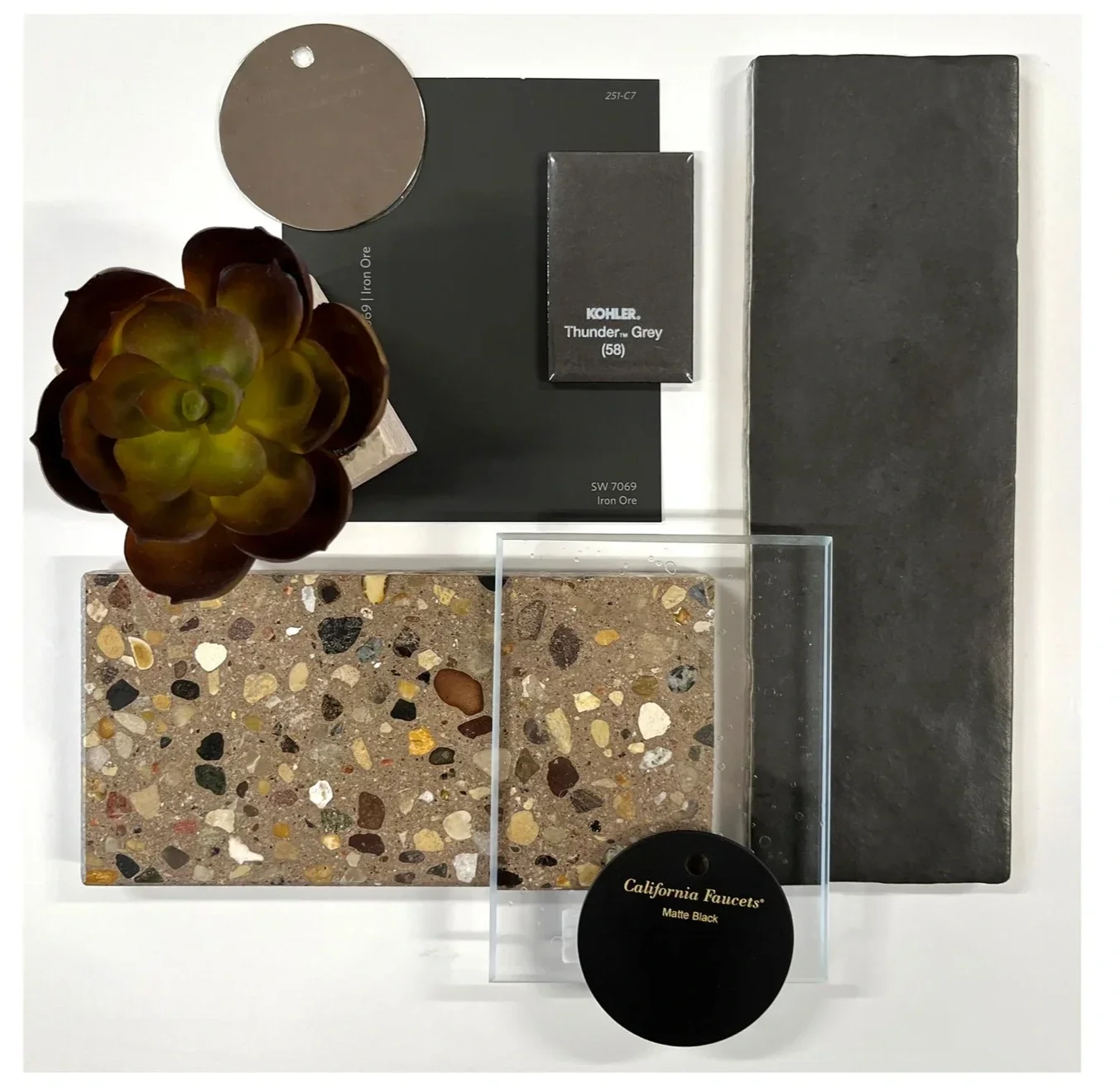
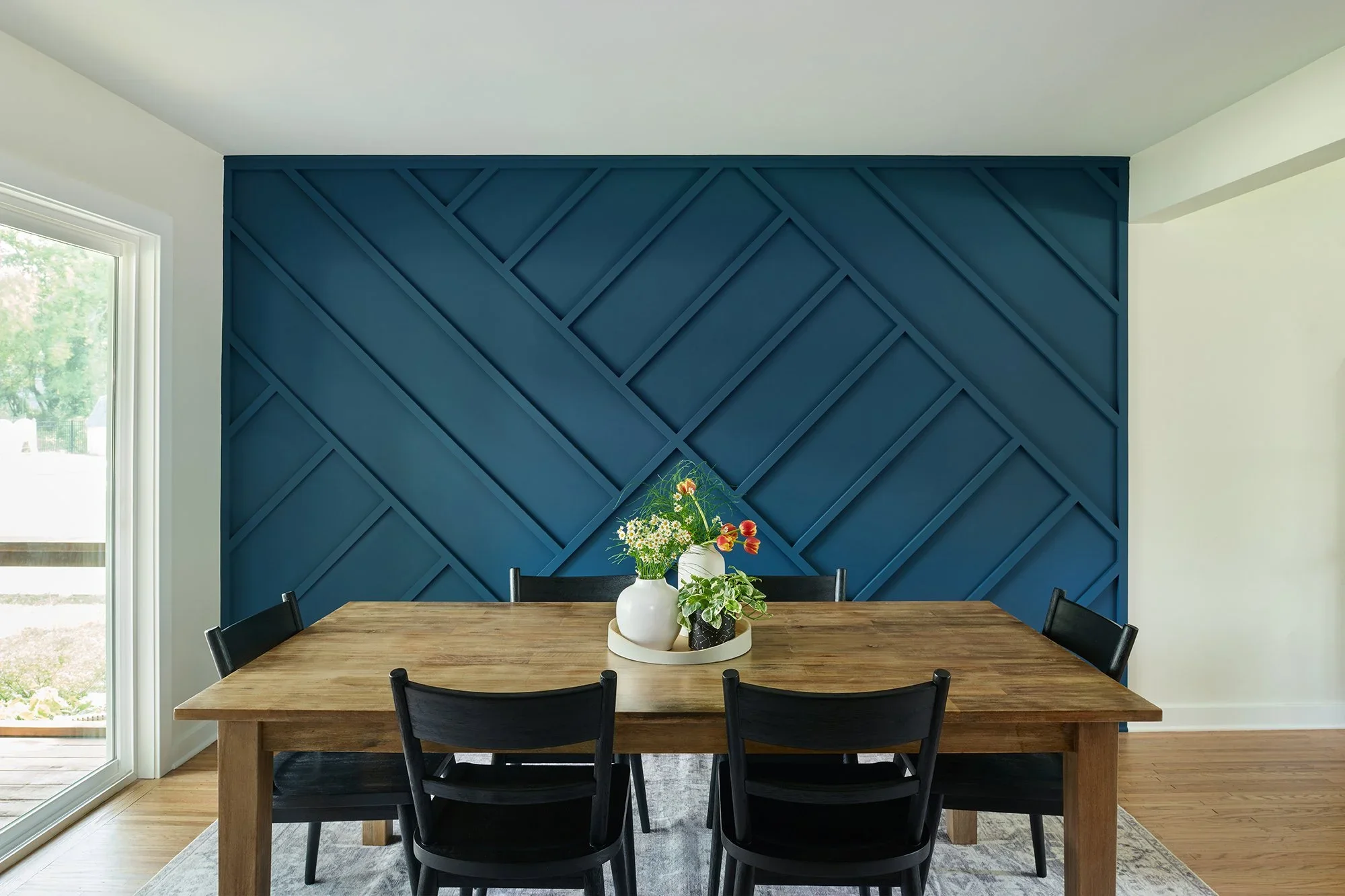
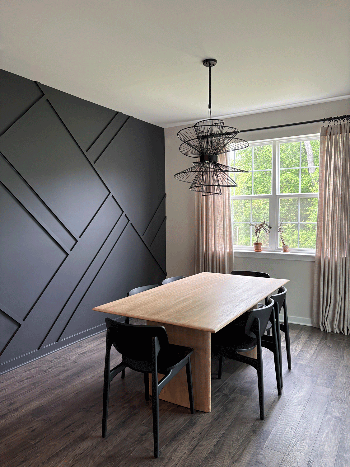
The main living space is very open, so our client wanted some kind of focal point. There are a lot of windows in this space, so this was the largest expanse that was conducive to a custom-designed accent wall. We specified Benjamin Moore Midnight Oil, which is a black that has a very subtle hint of purple in it. We opted for a matte finish so that this wall looks like velvet. The light walls and ceiling contrast the geometric accent wall, while the stark black dining chairs, drapery rod, and modern light fixture bring the black tone through the room. There’s a large sliding glass door unit across from the black wall and a window at the short end of the table bringing in plenty of natural light.
The bedroom feels like a cocoon which is just perfect for sleeping. Our client agreed to Benjamin Moore’s 2025 color of the year Cinnamon Slate, a dusty, subdued plum. The seams where the walls and ceiling meet disappear since we had the ceiling painted the same color.

Heritage Pine
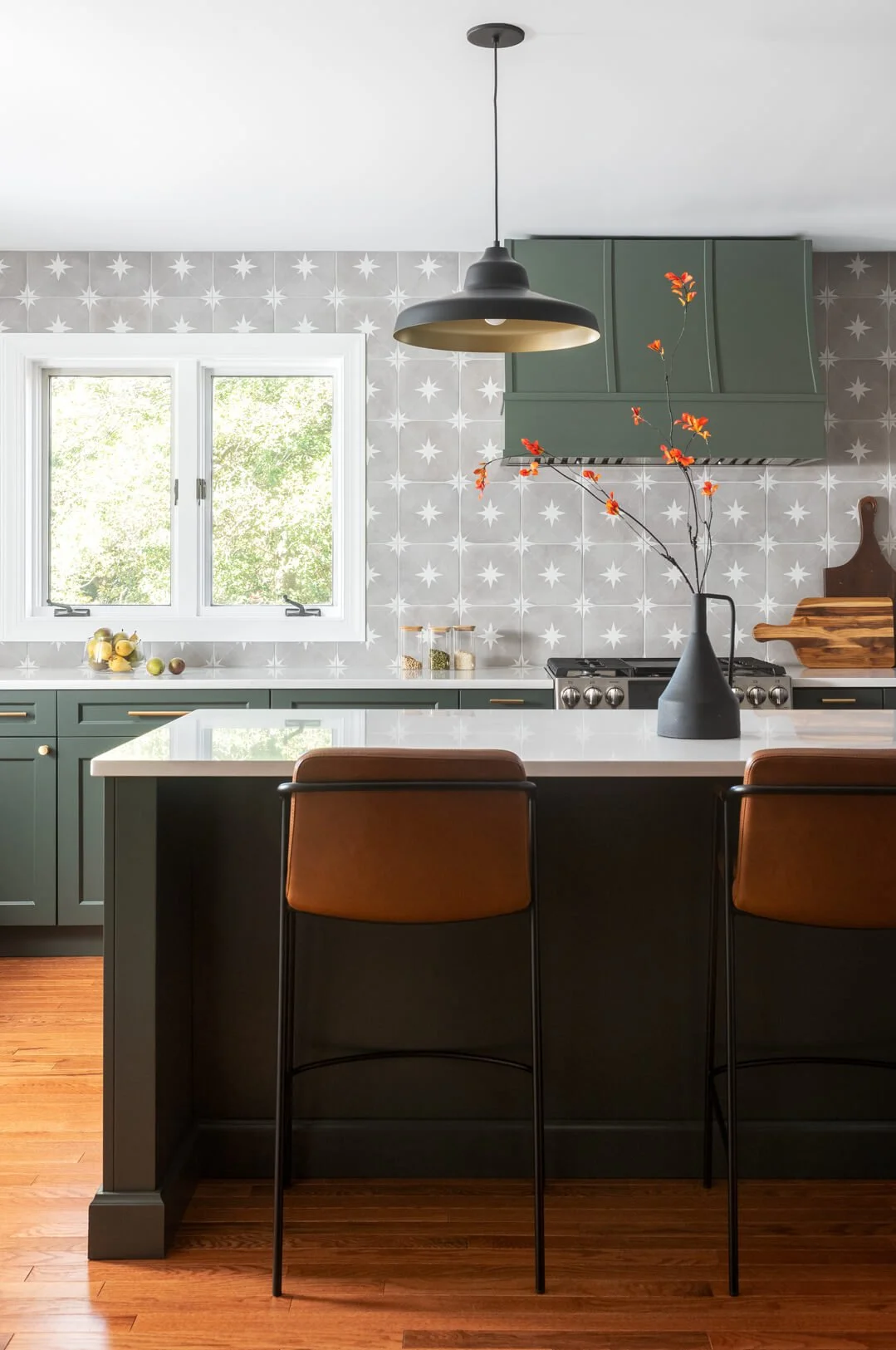
Kitchens don’t need to always have white cabinets. In fact, there are a lot of instances where white cabinetry can feel cold or sterile depending on the style or other materials in the room. When we received the link to inspiration imagery for this project in Collingswood, NJ I noticed a lot of photos with dark green cabinets—this was a non-negotiable.
These frameless cabinets are in Sherwin Williams Pewter Green which is even more lovely in person. It’s a very serene tone with a blue undertone. We had the range hood custom painted in the same color. As you can see, although the cabinets are dark, the space as a whole isn’t dark.
“A common mistake homeowners make is looking at one dark material and not taking it into context of the rest of the space. ”
This space has plenty of windows, light walls and trim, a light backsplash, a white ceiling and light countertops. That contrast ensures that the dark green tone isn’t overbearing.
1870 Victorian
We were so lucky to work on a home that has original woodwork that’s over 150 years old. Accentuating these details was a priority, especially in the parlor which is now used as a home office. The warm tones of the wood trim around the large windows and doorway are perceived as more vivid since they are next to a deep, saturated blue. Specifically, we specified Everard Blue by Benjamin Moore.

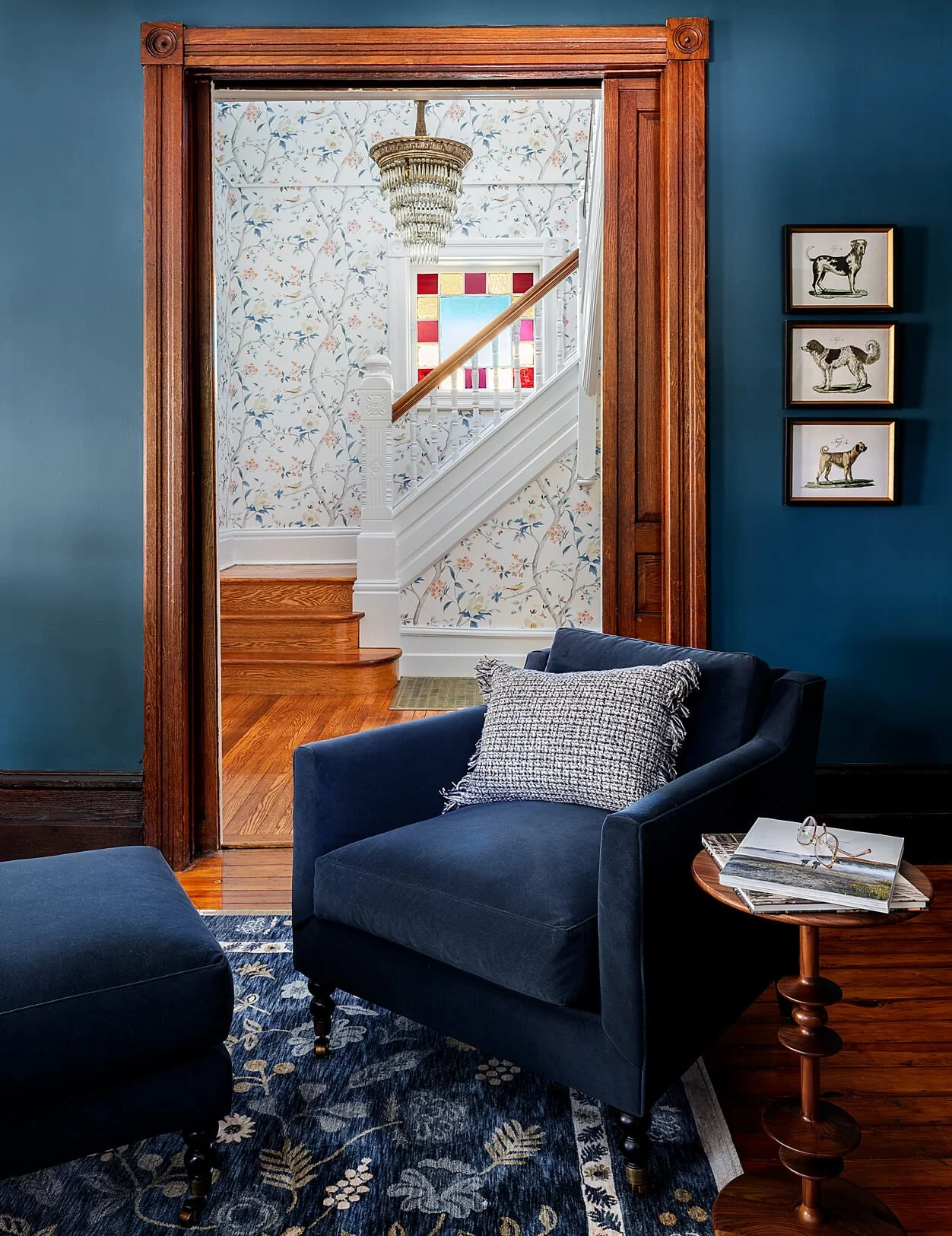
This space is right off of the foyer which features a bright two story space with floral wallpaper. This wallcovering has blue tones that help tie these spaces together. We wanted these spaces to compliment each other since the large pocket doors are often left open.
Most of the spaces on this floor are painted in a clean, fresh white (Benjamin Moore Chantilly Lace) which balances this dark, serene tone. However, we found ways to bring deep blues in as accents through the spacious living room.
Final Thoughts
Dark paints often feel a bit scary because there’s the misconception that it will make the space feel smaller or the entire room will feel claustrophobic. Not one of these spaces feels tiny because all of them have large windows, plenty of natural light and/or are part of a larger, open living space. Every element in a space needs to be decided upon giving the surrounding context.
Related Blog Posts