5 Don'ts When Picking Paint Colors
Of all the aesthetic decisions involved with a major residential or commercial project, one of the decisions that tend to stress clients out most is the paint color selection(s). Yet, I see so many homeowners and business owners make the same mistakes when evaluating their color options and then they are very surprised by the results. If you follow the advice listed below you’ll be way more confident about the next paint color you choose.
Don’t Skip Paint Swatches
Don’t just depend on photos you see on a computer screen—they aren’t reliable enough sources to get a feel for how a color will look in your space. Every computer or phone screen will show color differently. Further, you don’t know if the original photo taken is an accurate representation of that particular color.
Most paint brands now offer the option of ordering larger samples that you can either tape up or stick to the surface you’re thinking of having painted. Bonus: this is more convenient than getting a bunch of sample pots of paint.
Don’t Look at Colors on a Tabletop
This is the mistake I see most often—unless you’re actually painting a horizontal surface like a table-top or the floor, you need to hold paint samples up! Colors look completely different depending on how the light hits it. If you’re looking at paint colors for the wall, hold the swatches up to the wall, because that’s where the color will ultimately be.
It’s also a good idea to look at paint swatches on every surface because it will be slightly different. For example, if you're looking at a paint color for your dining room, you should look at it on every wall.
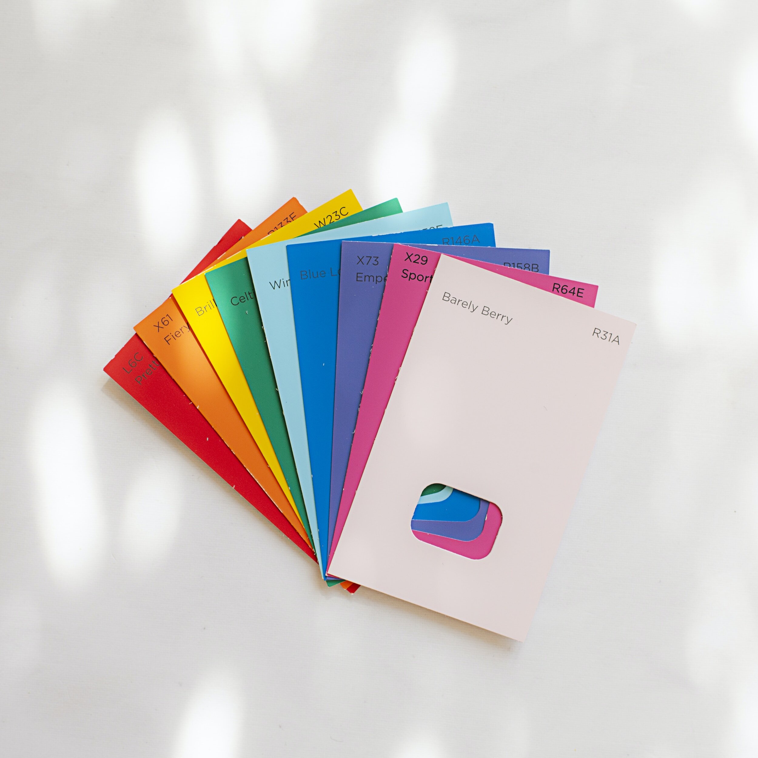
Don’t Look at Swatches too Close Together
I hate the long paint swatches that show several colors at a time. They don’t provide you with a true sense of the color. Without getting too much into color theory, the colors adjacent to another color influence how it looks. When you have individual swatches make sure you don’t place them directly next to each other when you are evaluating which color you like best. You want a decent amount of space between each swatch, I’m talking at least a foot or more. It’s even better if you just put up one swatch at a time and stand back.
I use our swatch books to narrow down which colors I’m interested in, and then I go to my large paint kit and pull a larger swatch of each individual color. I can’t tell you how many times I think, “oh geez, nope I actually don’t like that color at all.” Often a color looks completely different when you isolate it.
Don’t Forget to Look at Paint Colors Throughout the Day
Often after a Boutique Consultation we send clients larger swatches of the colors we discussed and I always remind them to look at colors at different times of day. The way color is perceived is heavily influenced by the time of day in regards to natural light. Artificial light adds another factor.
If you’re looking at paint for an exterior, you should be looking at the color on every side of your house throughout the day to be safe. Direct or indirect sunlight will make a huge difference as to how the color will look.
Don’t Pick Paint Colors too Early in the Project
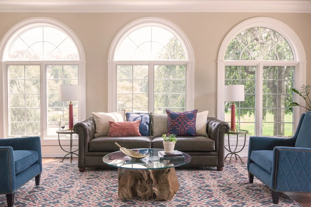
I’m going to tell you a secret. When we work on a renovation or remodel I usually select paint colors last. Why? Because there are endless paint colors. While there are only so many rugs, fabrics and furniture finishes (unless you’re going fully custom). Therefore it’s a lot easier to find a paint that coordinates with all your other selections rather than the other way around. In fact, if you select something like artwork first, it can help drive the color selection.
If you’re struggling with material and finish selections like paint, a Boutique Consultation might be just what you need to get your project over the finish line.
Related Blog Posts